I'm a Java Developer. But I'm also a Web Developer. Web Developers have been so badly maligned over the last decade or so that I always feel wary (and sometimes slightly ashamed) admitting this. There's some sort of assumption that Web Developers (and Front End Developers) aren't real programmers. Similarly, "real" developers don't like to be tainted by coming into contact with that nasty "front end stuff" in case someone mistakes them for a designer.
Trust me, no-one is going to mistake a Java Developer for a designer. For a start, when designers wear geeky glasses it's ironic. Or chic. Or something.
But developers will be forced to do something around the front end at some point in their lives. Even if it's because they're sick of manually kicking off some process and want to give the users a big red button to press instead.
So, as much to compensate for my own goldfish-like brain as anything else, I'm going to make a note of some of the CSS stuff I've used or found helpful during my mad scramblings to get the LMAX Trader user interface to a) look the way we wanted b) perform fast enough so our awesome back end performance wasn't totally invisible to the retail user and c) Not Suck Too Badly in Internet Explorer.
Part One: Horizontal Layout (or: There's No Excuse For Tables Any More)
You may (or may not) have heard that using tables for layout is a Bad Thing. But to be fair, most of us don't care. I've done it myself, it's usually the quickest way to lay stuff out on the page, especially if you're new to HTML / CSS and/or short on time. There are loads of arguments all over the web as to why this is a bad thing, but the reasons I didn't want tables on the LMAX UI was a) we saw the performance improve by a really simple replacement of tables with divs and b) given the amount the UI was mutating, divs positioned with CSS was going to allow us a much quicker turnaround for the umpteenth re-design of the UI (ideally the upshot of this would be letting the designers mess with the CSS when they changed their minds and leave us developers out of it).
Anyway let's assume Tables Are Bad. Tables are only for tabular data, not for layout. In my world.
1.1 Simple Horizontal Layout Using Inline
The most common use of tables for layout is where you put elements side by side - the default behaviour of divs is that they lay out underneath each other.
However it's pretty easy to get divs to behave this way too, and using divs has some advantages over using tables.

<html>
<head>
    <title>Horizontal flow</title>
    <style type="text/css”>
        #left {
            background-color: cyan;
            display: inline;
        }
        #center {
            background-color: yellow;
            display: inline;
        }
        #right {
            background-color: red;
            display: inline;
        }
    </style>
</head>

<body>
<div id="container”>
    <div id="left”>Left</div>
    <div id="center”>Center</div>
    <div id="right”>Right</div>
</div>
</body>
</html>
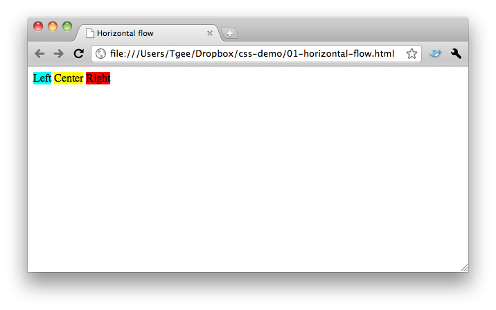
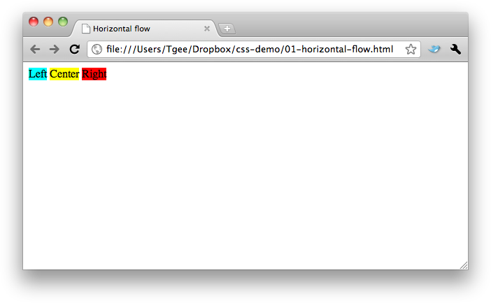
The first option is to use display: inline. This will lay div elements next to each other, similar to a span. This is the simplest way to get divs to appear side-by-side.
The disadvantage of this technique, however, is that inline elements can't be sized the same way as standard divs. By default they contract to fit the content.
The screenshot above is from Chrome on the mac - you'll notice by default the elements have some spacing between them. Reducing the margin/borders on the elements doesn't seem to eliminate this, so that's something else you might need to consider if you use this mechanism to display elements side-by-side.
1.2 Simple Horizontal Layout Using Floats

<html>
<head>
    <title>Horizontal flow</title>
    <style type="text/css”>
        #left {
            background-color: cyan;
            float: left;
        }
        #center {
            background-color: yellow;
            float: left;
        }
        #right {
            background-color: red;
            float: left;
        }
    </style>
</head>

<body>
<div id="container”>
    <div id="left”>Left</div>
    <div id="center”>Center</div>
    <div id="right”>Right</div>
</div>
</body>
</html>
Similar to using inline, floating a div will do the following:
- Make it shrink to fit the content
- Lay it out side-by-side with any sibling floating divs.
You'll want to apply padding, margins, height, width and whatever else to make it appear less rubbish.
1.3 Wrapping Horizontal Layout

<html>
<head>
    <title>Horizontal flow</title>
    <style type="text/css”>
        #left {
            background-color: cyan;
            width: 50%;
            float: left;
        }
        #center {
            background-color: yellow;
            width: 50%;
            float: left;
        }
        #right {
            background-color: red;
            width: 50%;
            float: left;
        }
    </style>
</head>

<body>
<div id="container”>
    <div id="left”>Left</div>
    <div id="center”>Center</div>
    <div id="right”>Right</div>
</div>
</body>
</html>
The advantage you have using divs over tables is that you can get the browser to work out how the elements should flow. Tables require you to determine exactly how many cells appear on each row, but with divs you can determine a width for each element and have the browser work out whether to show it on a new line or not. This will work with both percentage and pixel widths.
- If you want a more table-like structure where you know exactly how many elements should appear on each line, use a percentage of the screen with.
- If you know the width of each element, you should set a pixel width on the elements and have the browser work out how many to show per line.
The next CSS post will go over floating behaviour in a little more detail.


