

This is a continuation of my series of CSS hints / tips / cheats for developers (and other technical-but-not-UI people).
The screenshots are in Chrome on a Mac. The originals were on Firefox on Ubuntu so I can tell you the behaviour is identical.
Part Three: Column Layout Using CSS (or: still no excuse to use tables)
Today's example is a simple one, but worth knowing all the same. The aim is, once again, not to use HTML tables to provide any sort of layout. In most cases not only does using a div reduce the size of your DOM (and potentially help improve the performance of your page), it's actually a lot less complicated to organise your layout this way.
3.1 Display Elements or Text in Columns
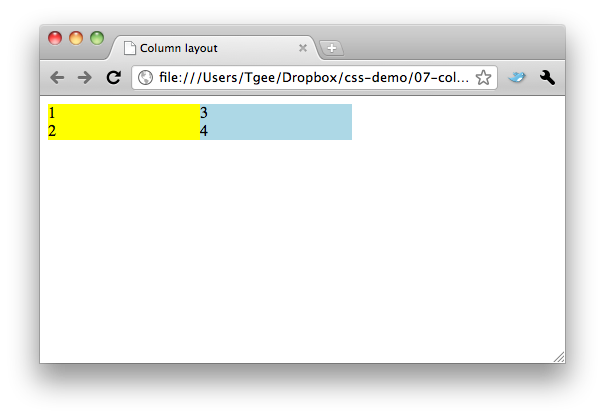
<html>
<head>
    <title>Column layout</title>
    <style type="text/css”>
        #col1 {
            background-color: yellow;
            /have to know the width /
            width: 30%;
            float: left;
        }
        #col2 {
            background-color: lightBlue;
            width: 30%;
            float: left;
        }
    </style>
</head>

<body>
<div id="col1”>
    <div>1</div>
    <div>2</div>
</div>
<div id="col2”>
    <div>3</div>
    <div>4</div>
</div>
</body>
</html>
Again you can see we're using float on the divs to get them to appear side-by side.
The code is much more intuitive organised this way - everything from a single column is grouped together in a single div. If this was done using tables, you'd have the content for a single column scattered in different cells on different rows of the table. Re-arranging the order of the columns in the case of tables is much more of a pain in the neck. With a div, it's a simple move.