First, an apology. I will be using the British spelling for "centre", because, well, I'm British. But it gets really confusing because you have to use the American spelling in the code. And doesn't "Centring" just look wrong?
Part Five: Horizontal and Vertical Centring
One of the most common things you want to do with blocks of content is to centre it. In particular, you would think that vertically centring content would be straightforward, but it turns out that in HTML/CSS it just isn't.
5.1 Horizontal Centring
Centring a paragraph of text is clearly easy - all you need is text-align: center. However, sometimes you want to centre a block, something like a div, without having all the text centred as well. This is slightly trickier than you might expect, because the only CSS attributes you have are for centring text.

<html>
<head>
    <title>Horizontal Centering</title>
    <style type="text/css”>
        #div1, #div13 {
            background-color: #DDDDDD;
        }

        #div2, #div14 {
            background-color: #BBBBBB;
        }

        #div3, #div15 {
            background-color: #999999;
        }

        #container, #container5 {
            border: 1px solid black;
            margin: 5px;
        }

        #container5 {
            text-align: center;
        }

        #to-center {
            margin-left: auto;
            margin-right: auto;
            width: 200px;
            border: 5px solid red;
        }

        #to-center2 {
            margin-left: auto;
            margin-right: auto;
            width: 200px;
            border: 5px solid red;
            display: block;
            position: relative;
            text-align: left;
        }

    </style>
</head>

<body>
<div id="container”>
    <div id="to-center”>
        <div id="div1”>One</div>
        <div id="div2”>Two</div>
        <div id="div3”>Three</div>
    </div>
</div>
<div id="container5”>
    <div id="to-center2”>
        <div id="div13”>One</div>
        <div id="div14”>Two</div>
        <div id="div15”>Three</div>
    </div>
</div>
</body>
</html>
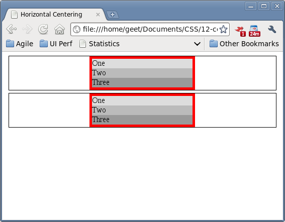
Using margin-left: auto and margin-right: auto on the block you want to centre is a neat trick for doing this. And it works fine in Chrome and Firefox. However, it's not so great in IE 7:

The trick for getting it centred here (the second block) is to set text-align: centre on the div containing the block to centre (container5), then reset the text-align to left on the centred block (to-center2) so the text isn't centred. Yes, a total faff.
However, there is some good news. You can get IE to behave the same way as the more sane browsers by setting it into Strict Mode:

Remember kids: Strict Mode Is Your Friend. And all you need to do is add the following to the top of your HTML file:
<!DOCTYPE HTML PUBLIC “-//W3C//DTD HTML 4.01//EN” “http://www.w3.org/TR/html4/strict.dtd">5.2 Vertical Centring

<html>
<head>
    <title>Vertical Centering</title>
    <style type="text/css”>
        #div1, #div4, #div7 {
            background-color: #DDDDDD;
        }

        #div3, #div6, #div9 {
            background-color: #999999;
        }

        #div5 {
            height: 40px;
            line-height: 40px;
            background-color: yellow;
        }

        #div2 {
            height: 50px;
            background-color: orange;
            vertical-align: middle;
        }

        #div8 {
            height: 40px;
            line-height: 40px;
            background-color: cyan;
            font-weight: bolder;
        }

        #container1, #container2, #container3 {
            border: 1px solid black;
            margin: 5px;
        }

    </style>
</head>

<body>
<div id="container2”>
    <div id="div4”>One</div>
    <div id="div5”>Two</div>
    <div id="div6”>Three</div>
</div>
<div id="container1”>
    <div id="div1”>One</div>
    <div id="div2”>Two</div>
    <div id="div3”>Three</div>
</div>
<div id="container3”>
    <div id="div7”>One</div>
    <div id="div8”>Massive line of text that needs to wrap to show the centering totally doesn’t work when you have more than one line of text.</div>
    <div id="div9”>Three</div>
</div>
</body>
</html>
Given some of the problems with horizontal alignment, it shouldn't come as a surprise to find vertical alignment is not simple at all.
Us straightforward developer types would expect to be able to put vertical-align: middle on a div and expect all content inside that div to be, well, vertically aligned in the middle. However this is not the case - see the orange block above. A quick Google will tell you why this doesn't work, and I don't intend to duplicate the explanation here.
There is a nice hack which works for single lines of text though: if you set the height of the container and the line-height to the same value, the text will be vertically centred within that container (see the yellow panel, div5, above). This works really well for things like buttons or icons.
However, it doesn't work so well for paragraphs of text or sentences that might wrap, line-height is for a single line of text only. See the cyan panel above for what happens if your text wraps.
I'd love to give you an answer on how to get this to work for text that wraps, but I haven't found a satisfactory solution yet. What I usually do is set a fixed height on the container and then set the margin on the text so that it sits in a way that looks vaguely centred. Not a solution I'm happy with, because a) it can sometimes render slightly differently on different browsers b) it's a very fragile solution if you're going to internationalise your page as some languages will have longer or shorter paragraphs and c) it feels like a massive hack.
If anyone has a nice solution for vertically centring paragraphs of text I'd love to hear it.


